*Disclaimer: Project was created as apart of the Coursera User Experience Design Course. Artikal is not a real app.
Overview
Artikal was conceived to empower art enthusiasts worldwide, offering them a reliable and current resource for information on artworks displayed in galleries.
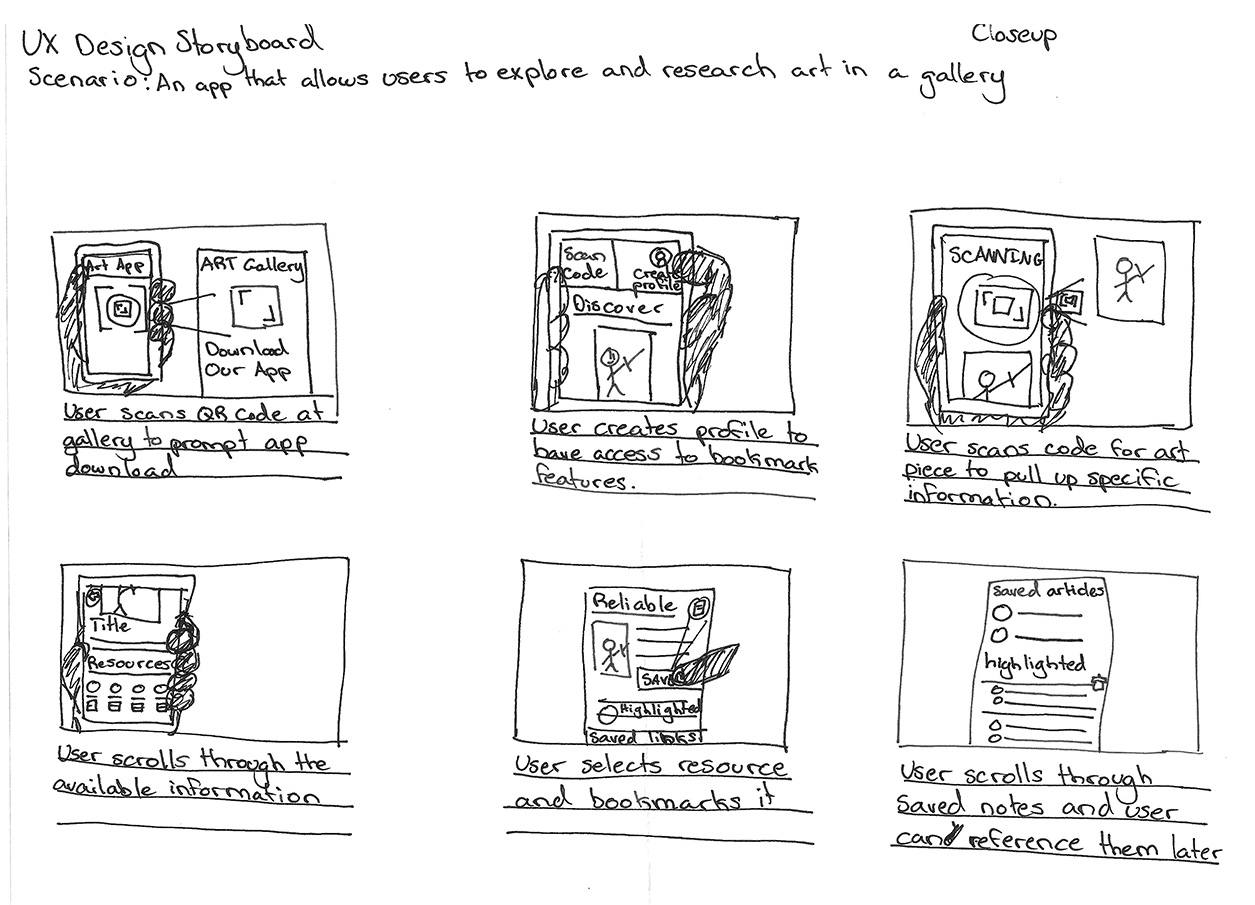
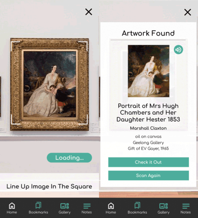
Users can instantly access information by scanning artwork or searching the extensive database. The app aggregates articles from verified sources, enabling users to compile and save them for future reference.
Role: UX/UI Designer
Design Challenge: Create a user friendly app that can offer art history information for different galleries
Target Audience: Art students, Art enthusiasts
The Process
Understanding the User
To determine the needs of potential users, I developed interview questions for art gallery visitors. These questions aimed to gather feedback on features they would like to see in an art history app. Many interviewees acknowledged that they wouldn't actively seek out the app unless they were already in a gallery. Therefore, the app's value must be evident during the gallery visit, enhancing the experience rather than detracting from it.

Paint Point One
It's difficult to find credible information online on artists and their work.

Paint Point Two
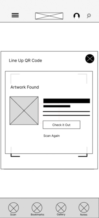
Trying to find individual titles is a hassle to find information on while at the gallery.

Paint Point Three
There's not enough information available at the galleries. Little cards with a date and a name are not very informative.

Paint Point Four
Finding a credible article and then making sure you don't lose that article later is difficult.
Persona
Jeremy Peters
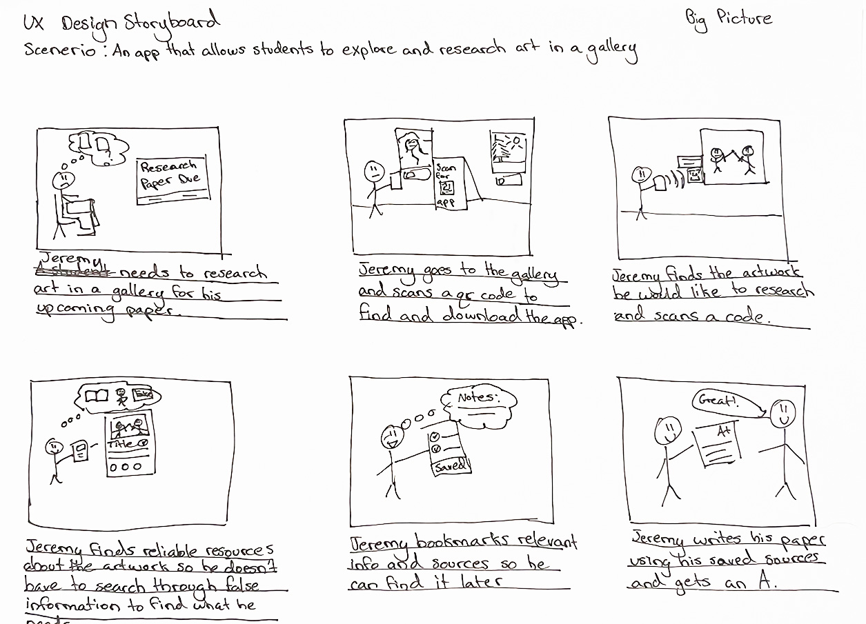
Jeremy Peters is an Art Student in college with art history requirements who needs an easy way to research art in a gallery for his project because there are too many unreliable resources outside of the gallery.
 Age: 20
Education: Second year college
Hometown: Denver, Colorado
Family: Single with roommate
Occupation: Art major. Server at local restaurant
Jeremy is an Art Major at UCD. He’s very passionate about art and loves to visit art museums and galleries when he can. His school work involves him researching and writing about works of art he sees, but he finds that the galleries don’t have much information available and the information elsewhere is scattered and often inconsistent across different resources. He wishes there was a reliable source with extensive information available.
"Art is a way of life. I just have to graduate before I can start living."
Goals
- To graduate with his BFA from UCD with good grades.
- To pass his Art History course without too many obstacles.
Frustrations
- "There are so many resources for art research and none of them say the same thing."
- "Galleries don't tend to have more than a quick expert about the artwork they display"
Wireframes
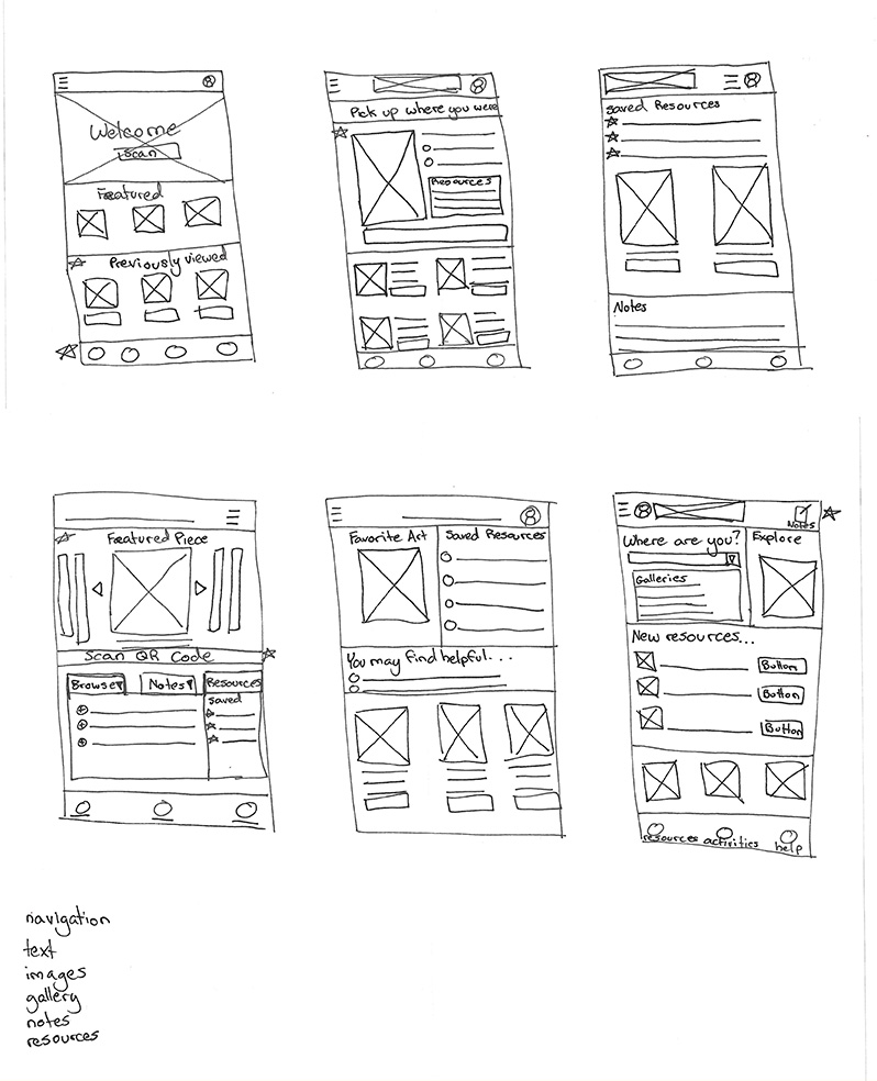
Quick Paper Variations
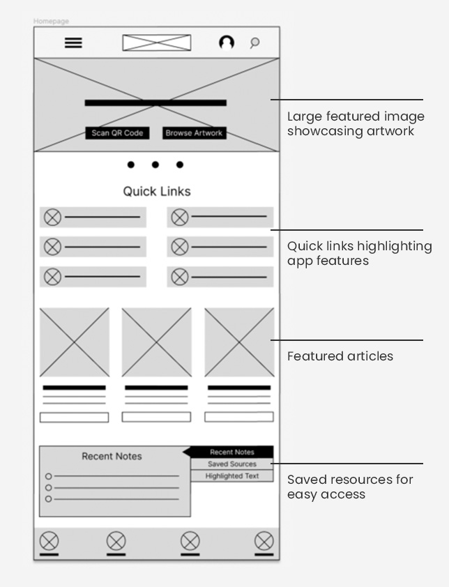
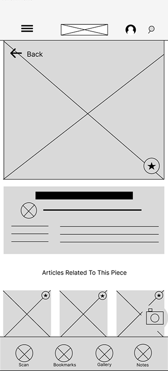
First Digital Wireframe
Usability Study Insights

Finding One
The home screen has too much content which makes it overwhelming.

Finding Two
The main call to action needs to be more obvious.

Finding Three
There are too many features included on the app making it confusing as to what step comes next.

Finding Four
It's too easy to get lost if you click on the wrong thing. There needs to be a clear navigation.
Refinement
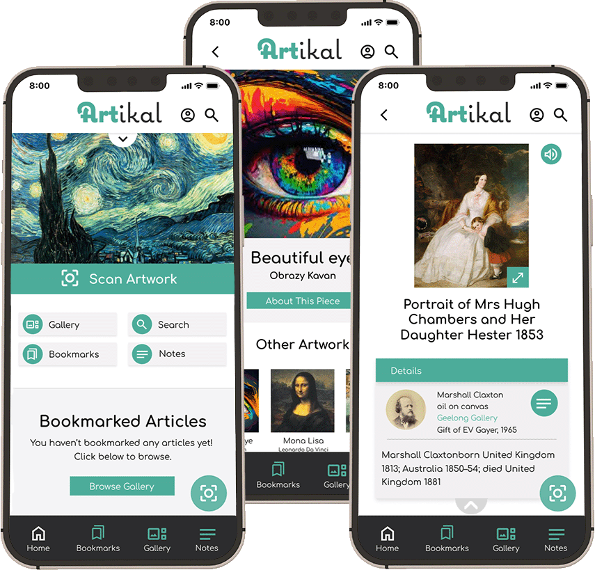
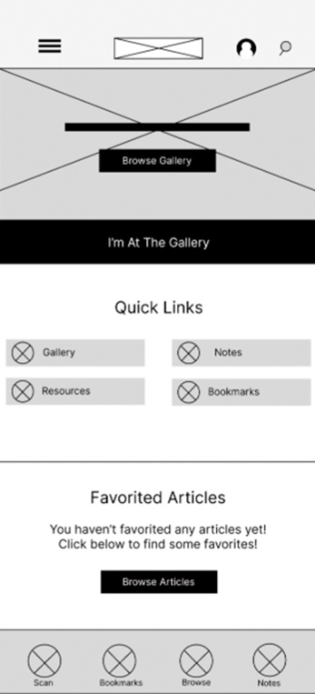
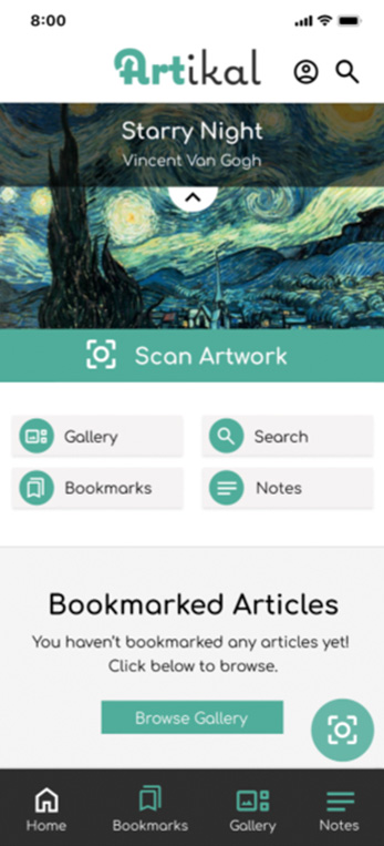
Based on user feedback, I redesigned the home screen. I placed a prominent call-to-action (CTA) below the hero section to guide users to the desired action. Additionally, I simplified the quick links section for a cleaner, more digestible look. To highlight quick access without overwhelming users, I transformed the featured articles section into a bookmarked articles section, ensuring key features remain visible and accessible.
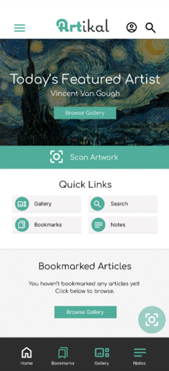
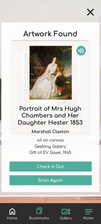
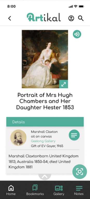
The Final Product
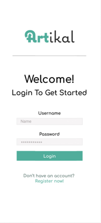
Accessibility Considerations

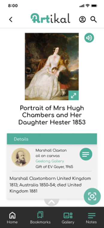
Given that the app predominantly consists of written content, screen reader options are crucial. The entire app is designed to be readable by screen readers. Additionally, on text-heavy pages, icons are placed near headings to facilitate easy access.

Considering that the app is intended for visitors from diverse backgrounds, addressing language barriers is paramount. In addition to a translation feature, I integrated recognizable icons to ensure straightforward navigation.

To accommodate users relying on assistive technology, I maintained a standard grid layout throughout the app. This layout ensures easy navigation via voice commands or other assistive methods.
Takeaways
When designing an app intended for primarily local use, simplicity and ease of use are key. Additionally, it's crucial to think about how to make the app functional from anywhere to encourage regular use and repeat visits.

